Overview
Ideated and prototyped a solution to personalize, streamline, and alleviate frustrations in the Netflix content discovery experience
👩🏻💻 My Role: Product Designer
🤝 Team: Individual
⏰ Duration: January 2022 - May 2022
⚒️ Tools/Skills: Figma, User Research, Wireframing, Prototyping
The Problem.
When people click into the Netflix app, they want to watch shows that are worth their time — whether it’s to relax with good entertainment, to be transported into a whole different dimension, or to simply connect with friends. However, they can’t do that well because:
1.
There is an overwhelming amount of content on the app, making it hard to digest and find something that matches their needs
2.
They don’t want to waste so much time on a show or movie that they might not even end up liking
3.
The recommended content that they find on the app doesn’t feel personalized enough to them
My Solution.
Rediscovering the Discovery Experience: Comparison-based Recommendations
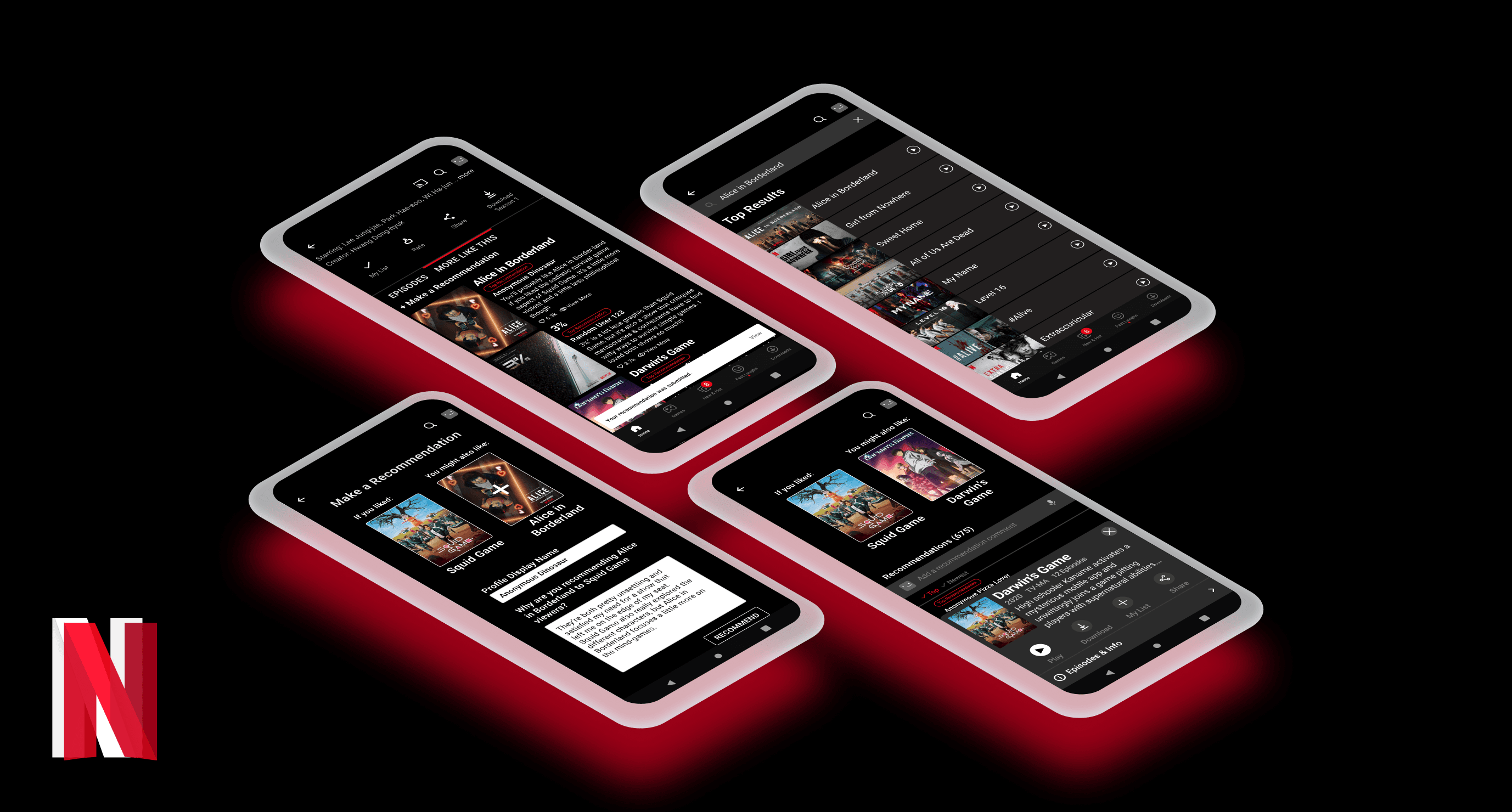
I came up with a feature idea where users have the ability see review-backed, comparison-based recommendations of additional shows based on ones they already like.
Comparing the new, unfamiliar shows with a show they already know they like will make the recommendations feel more personalized and digestible. Because users will see the human insight on why they would like a recommended show, they'll have more trust in the recommendations and feel more confident going into a show instead of wasting time in frustration scrolling through the overwhelming wall of show and movie posters.
My Journey to the Final Cut
How did I get to my final design prototype? Head over to my full Netflix Case Study on Medium or continue reading below!
Behind the Scenes
Understanding the struggles in discovery. Why is it so hard to find new, enjoyable content on Netflix?
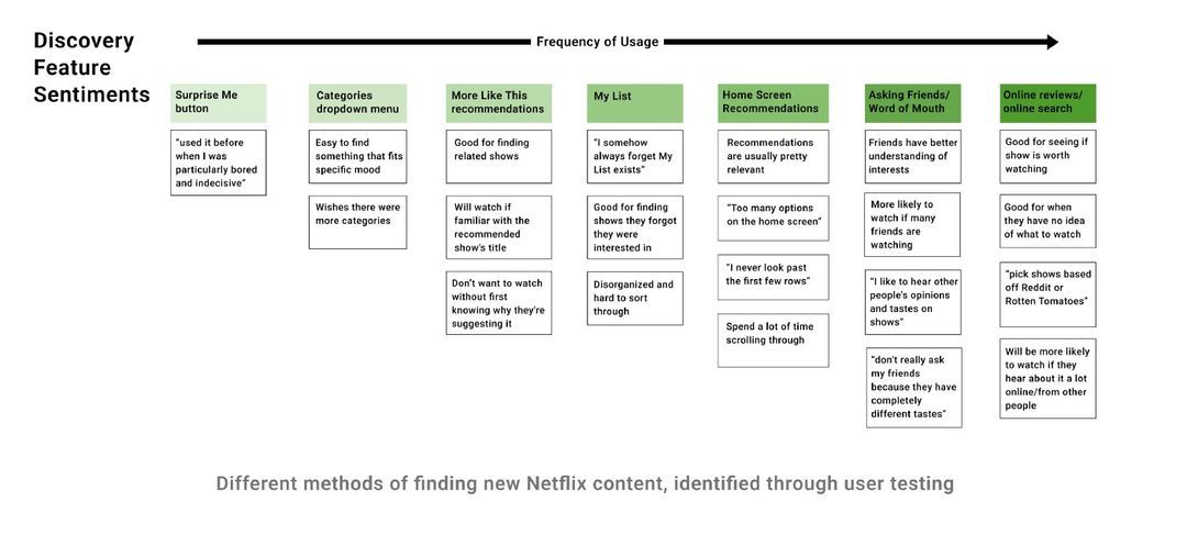
I interviewed Netflix users from the ages of 16 - 40 to find out their habits and attitudes in their content search processes, also asking them to walk me through how they interact with current app features in selecting something to watch.
My goal was to identify any pain points within the content discovery process in order to learn how to alleviate those frustrations. Here are some of my key insights:
Users weren't sure where they could find shows that they’d like, often spending more time scrolling than watching
“I end up spending an unjustifiable amount of time scrolling through the different categories and will just resort to watching YouTube or TikTok instead”
Users feel overwhelmed by the number of options given
“There’s too many options on the home screen and it’s too much for me to try and look through everything”
People value opinion from other people— users trust more personalized, humanized recommendations over the auto-generated ones
“My friends have a better understanding of what I like… their recommendations are better than the computer-generated ones on Netflix”
“I often base what I watch off of things I see or hear online or through word of mouth. I like to hear other people’s opinions and tastes on shows to get more insight on why they think that shows is good”
Users want to know the reasoning behind shows or movies that are recommended to them
“I don’t really like going off the shows that they recommend to me. I don’t want to start watching a 40 minute episode without first knowing why they’re suggesting it to me or why I might like it”
Sorting through the trends and insights from my user interviews, I discovered that users experience a lot of frustration and encounter many pain points in the Netflix content discovery experience
Brainstorming: Let's Get the Show Started!
I started tackling my people problem by brainstorming solutions to the question:
How might we create a more personalized and approachable way to find new shows on Netflix?
Potential Solutions
I came up with multiple solutions that had potential in addressing these questions. Through voting and with a feasibility and impact matrix, I narrowed down to three solution ideas to further consider.
1. Multiple Settings: Ability to create and customize different settings that cater to specific moods, vibes, or events
2. Friend Recommendations: Ability for users to create, share, and view recommendation lists with friends
3. Comparison-based Recommendations: Ability for users to see review-backed, comparison-based recommendations of additional shows based on ones they already like
All the potential solutions I considered catered to improving the app. But by thoroughly weighing the strengths, weaknesses, opportunities, and threats of each of my top 3 ideas, I determined the feature that would best address the needs I discovered in my interviews would be Comparison-based Recommendations.
Review-backed recommendations comparing a show that a user already knows and loves, with a different show on Netflix, will alleviate their pains of searching for a new show. Comparing the new, unfamiliar shows with a show they already know they like will make the recommendations feel more personalized and digestible. Because users will see the human insight on why they would like a recommended show, users will have more trust in the recommendations and feel more confident going into a show instead of wasting time in frustration scrolling through the overwhelming wall of show and movie posters.
Design Iterations
Determining an Entry Point
I started tackling my people problem by brainstorming solutions to the question:
Initially, I pursued Option A out of my three explorations. However, through critique and feedback, I found that this placement could be unexpected and confusing for users. For Option B, users thought displaying it in the search results would be annoying because they usually search with something specific in mind and don’t care about other comparable shows. Users liked the idea of having the feature somewhere more integrated with the app where they’re already expecting it, leading me to choose Option C.
Experimenting with Visual Design and Layout
My goal for Option A was to display each recommendation with a clean design, taking inspiration from the Netflix New & Hot screen. Users can view each trailer and gain a better idea of what the recommendation is about. With Option B, I placed the recommendations side by side next to each poster image, so that users could view more recommendation options at a time. They could then click on the poster image for the pop-up details if they are interested in that show.
Through user feedback, I learned that the amount of space each trailer and recommendation takes up in Option A could make scrolling through each option more tedious and time consuming. Because my design intent was to make the discovery process more efficient, I pursued Option B.
Viewing Comparison-based Recommendations and Adding to My List
With this feature, users can see the top recommendation comment for each show, and then click into “View More” to see all of the recommendation comments of that show. When they’re viewing the comparison-based recommendations, users might want to add the recommended show to their Netflix My List. In my initial flow, users could click on the show poster for the pop-up details card, and proceed to add it to My List from there.
However, through user testing, I learned:
Users liked that you could click on the show poster to see the pop-up card on more show details because it is familiar to them, but they wished there was a more direct way of adding a show to My List
Users were confused by the “Add a recommendation comment” section and didn’t know if that was the same as the “Make a Recommendation” button on the initial screen
Taking the user feedback into consideration, I made a few changes.
Making Recommendation Flow
With this feature, users might also want to make their own comparison-based recommendations if they’ve watched two shows with similarities that other viewers might also enjoy. Because Netflix users may want to stay anonymous, I incorporated the ability to set a profile display name when making a recommendation.
After user testing, I learned:
After selecting a show to recommend, users wondered if there was a quick way to change their selection
Users felt a little lost after they submitted a recommendation — they liked knowing that their recommendation was sent, but they wanted to go back to the main screen
Taking the user feedback into consideration, I made some more changes.
The Final Flow: Viewing + Making Comparison-based Recommendations
Ultimately, this feature:
Gives users more personalized and humanized recommendations
Aids users in deciding if a show is worth their time or not
Alleviates the overwhelming and frustrating feelings in the Netflix discovery process
And… Action!
The Final Cut: Prototype Design
My final prototype for the feature showcases how users can view comparison-based recommendations made by other users and make a recommendation themselves.
Conclusion: Closing Shot
Netflix is a phenomenal service for watching a variety of content, from trending shows to award-winning movies and documentaries. However, the difficulties in searching for new content to watch only creates frustration towards the platform. People are less likely to use Netflix if it’s a chore to simply find something enjoy.
There is an opportunity to create a more streamlined experiences on Netflix. With a more personalized way of discovery through comparison-based recommendations, people can easily find more shows they’d like on Netflix, feel less discouraged in the search process, and ultimately be more incentivized to keep their subscription
Some Final Thoughts
Final Result
I completed a full case study on Netflix, creating a final high-fidelity prototype of a new feature that targets current pain points in discovering new shows to enjoy on Netflix.
Self Reflection
This was my first official introduction to product design. Coming into this class, I had an pretty surface-level grasp of design; I loved brainstorming ideas and working with visual elements like colors and shapes. I thought that the ideas I initially liked the most would be the perfect solutions to the problem. Little did I know I had the complete wrong idea of how to design a good product.
In completing this case study, I’ve learned how to think in the perspective of a designer—through brainstorming, interviewing, designing, and prototyping, but also through recognizing mistakes, asking for feedback, and most importantly, understanding people’s needs. I realized that I want to be a designer who designs not just to make things pretty or usable, but to create genuinely meaningful experiences for people and relieve their pain points.
Feel Free to Check out my Other Projects!


